– The wise words from Steve Krug, the author of Don’t Make Me Think: A Common Sense Approach to Web Usability.
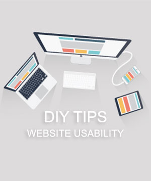
Usability, although sounding simple, isn’t as easy to accomplish as you may think. Usability is much more than getting rid of that intrusive pop up, or changing a few colors on the homepage. It’s a mixture of design, function and form working together to create a practical, attractive website. This practice falls under the category of user experience, or UI/UX.
As a business owner, it may be hard to understand, or care, about website usability. Is it paying my electricity bill? No. Then how will it help? Take it from a professional web designer, usability is the most important element of user experience design in your website.
It brings users through a journey; informing them about what you have to offer, your mission, your goals, then eventually leading them to purchase from you. Giving your users a journey to follow from the start of their visitation will lead to more customer engagement and an increase of sales and revenue. So, yes. It will pay your electricity bill down the road.
How To Make Your Website More Usable
Intuitive Pages, or Easy to Follow Pages
Good usability makes web pages intuitive, thus making the user experience much more pleasant. When usability is high, things are self-evident, self-explanatory and easy to stay engaged with. When usability is low, things are difficult to understand. You won’t immediately get the company’s message, or you might spend more time than you’re willing to admit to find the “contact us” page.
Just think about the last website you visited. After opening the home page, did you know where to go next? Did you understand what they were selling (or informing you about), immediately? Did you visit more than two pages? If you answered “no” to any of these questions, that website needs some major website design help!
In the design process, good website designers are already planning on how to make your webpages more intuitive. We understand that not everyone has the resources to hire a full-time creative designer. So, what we can offer are some do-it-yourself tips.
- Label stuff. Break up your long walls of text with attractive subheadings. Labeling each section will help your users understand context before they make the effort to digest it.
- Clear, bold navigation. Highlight your pages, don’t hide them. If you decide to add other links to your pages throughout your website, make sure your links are easy to find (large buttons help)!
- Subtle repetition. Obviously you don’t want just repeat “this item is for sale,” 20 times, but you do want think of 20 different, creative ways to reiterate that fact that it’s for sale. Like saying your name 7 times in a row, messages are more effective and memorable if repeated.
Easy Read for Scanners and Skimmers
Usability is crucial because people don’t want to read online. Think about it! When’s the last time you read a full five page essay on your desktop? Did you really read the entire biography (word-to-word) about Steve Jobs on your iPad? Probably not. Most people skim, scan and jump around a webpage to get the information they need. Rarely will they stop to read the paragraph describing your mission. Knowing this, what would make a more user friendly webpage?
- Short headings that are packed with information. (i.e, “Easy for Scanners and Skimmers.”)
- Space to breathe. Create more whitespace and padding around your headlines, paragraphs, images and content sections.
No Dead Ends
Let’s be real here. People are unpredictable, and frankly, they often make non-optimal choices. Good designers make sure all clickable areas inside of a website lead the user down a specific path (whether or not it’s relating to what path they’re on now). Take Amazon, for example. You started off with searching for new notepads and pens for the office. No longer than thirty minutes later, there’s a new laptop case in your cart and birthday gifts for all your friends! When you’re entering your credit card information you’re probably asking yourself “how did I even get here?” Simple answer, Amazon makes sure there are no dead ends, no matter what path (or link) you decide to take. This is an example of great website usability/buyers’ journey.
Don’t give your users any dead ends! When you’re creating your website, make sure to envision the journey of each type of user. Bring them down the “rabbit hole,” and you’ll maximize your results. Our do-it-yourself tips to limit any dead ends and make your website more user friendly:
- Internal links only. Links should only direct to other pages in the website. Even if they’re disinterested in this topic, they will stay engaged with something else on your website.
- Every page (even the check-out page) should have options to explore other things. Like a brick and mortar store, a lot of impulse buying happens at checkout!
- Your “other links” don’t just have to be buttons leading to product. Like mentioned before, people are unpredictable. Give users the option to explore other products and the option to learn more about your company. Just make sure at the end of each option there’s another link!
Not sure where to start with website usability? Talk to the experts at FireDrum. We want to help your business succeed by creating efficient, functional and profitable websites.
 |
 |
 |


